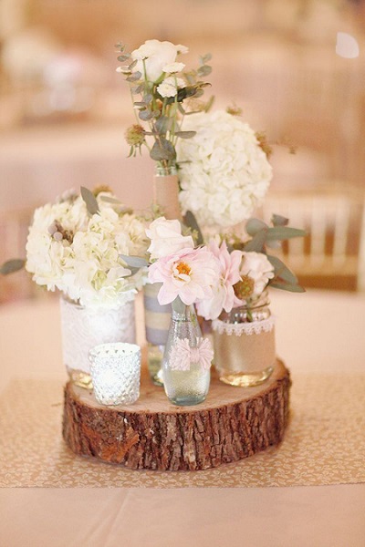
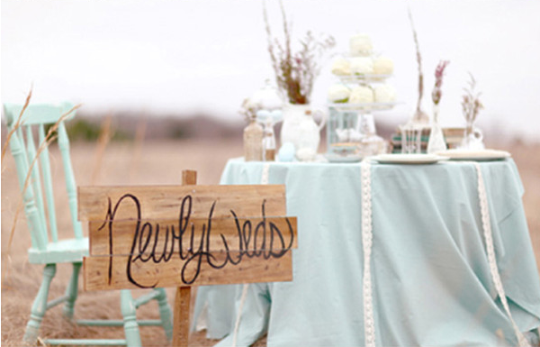
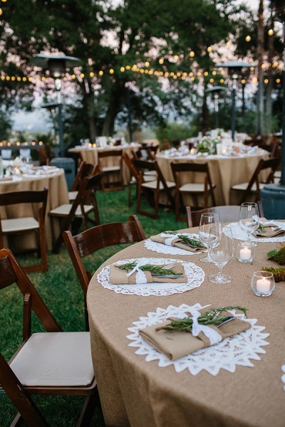
Spring is in the air, and with the changing season comes brighter tones and soft pastels. Pantone is world’s leading color authority, influencing every industry from fashion to printing with its picks for the hottest colors of each season. The theme for spring 2015 is en plein air, taking a cue from nature with its minimalistic theme. These colors range from soft cool hues to subtle warm tones, giving weddings a wonderful base palette to draw inspiration from. We took our favorite spring picks and paired them with gorgeous colors to create these stunning color combinations you need to try for your spring wedding.
Scuba Blue
An invigorating turquoise that adds a splash of excitement to your wedding’s palette, Scuba Blue is a bright and fun way to say hello to spring.
Perfect Palettes:
Scuba Blue, Coral and White
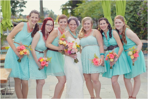
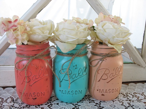
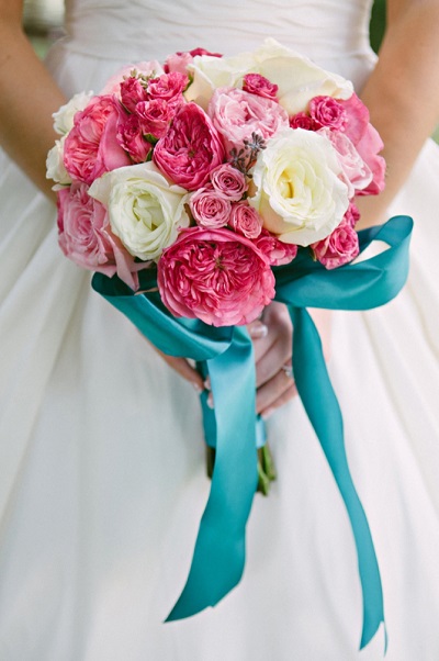
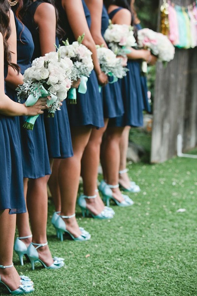
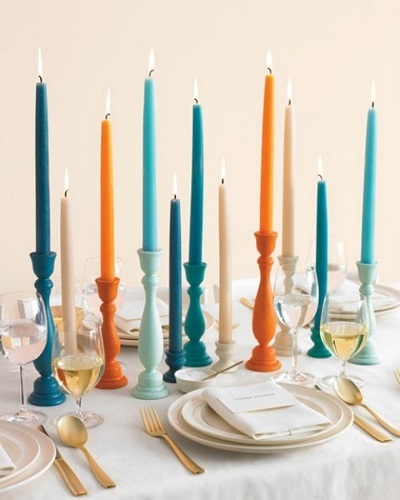
Are you ready to welcome spring with a bold and vibrant mix of colors? Try pairing Scuba Blue with bright coral and white tones for your big day. These contrasting colors will really make each shade stand out, whether it’s in your bridesmaids’ dresses, table settings or wedding bouquet. This combination is eye-catching and will start this year’s wedding season off with a memorable, bright and happy theme.
Photo Credit: Vanessa Joy Photography
Photo Credit: The Shabby Chic Wedding
Photo Credit: Gallery Hip
Scuba Blue, Gold and Royal Blue
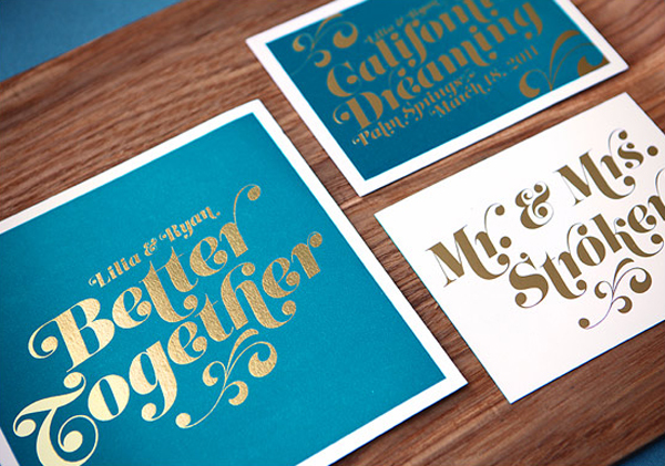
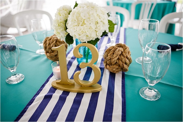
If you prefer to stay on the cooler side of the color spectrum, combining Scuba Blue with a rich royal blue and bright gold accents will create a lovely palette to bring in the new season. This bright turquoise combined with a darker shade of blue creates a beautiful backdrop for any wedding, whether it’s indoors or outdoors. Metallic gold accents are hugely popular this year and look great in tandem with these cool colors in décor, invitations and more.
Photo Credit: Fab Mood
Photo Credit: Elizabeth Anne Designs
Photo Credit: Melissa Manzione Photography
Lavender Herb
Pretty pastels are frequently associated with springtime, and Lavender Herb is a beautiful pastel purple that reminds us of Easter eggs and blooming wildflowers.
Perfect Palettes:
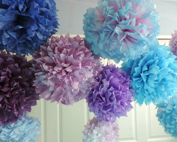
Lavender Herb, Aquamarine and Glacier Gray
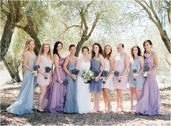
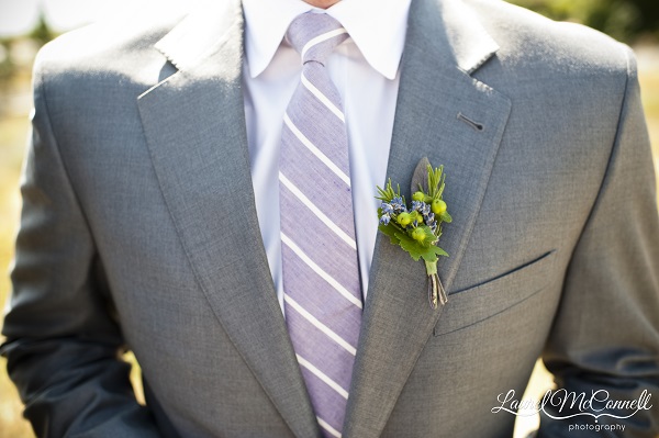
We loved these three Pantone spring color choices together – a pale purple, light powder blue and neutral gray combine perfectly to create a beautiful pastel palette for any spring wedding. Because lavender and aquamarine are close together on the color spectrum, they are the perfect colors to experiment with for mismatched bridesmaid dresses.
Photo Credit: Laurel McConnell Photography
Photo Credit: Jose Villa
Photo Credit: Hand Dyed Poms
Lavender and Mint
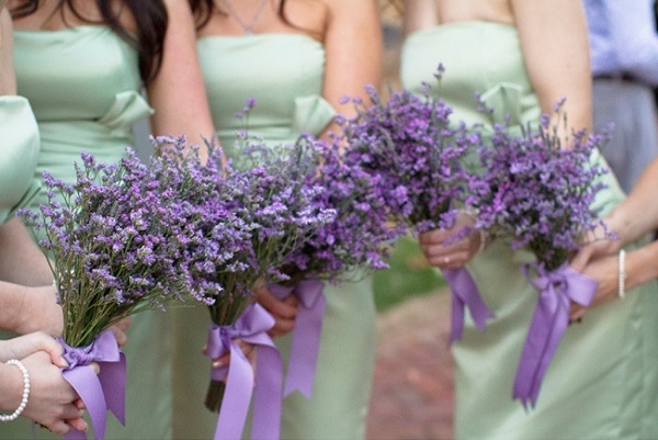
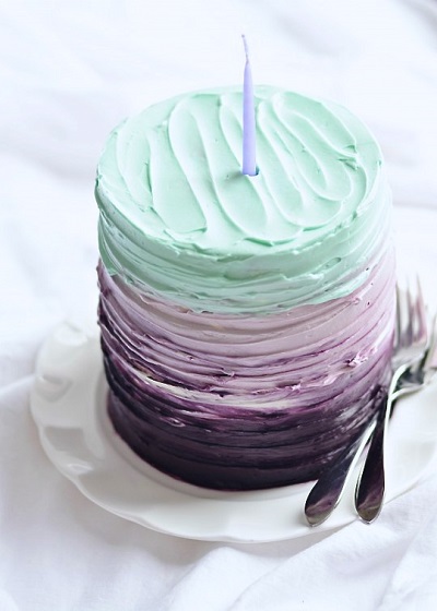
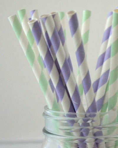
Complementary colors can create simply the most beautiful color schemes. We love the idea of using two incredibly popular pastel shades, lavender and mint, together! Although purple and green don’t initially seem like they would go well, these pastel tones actually look really beautiful together and make great contrasting décor, bridesmaids dresses and bouquets, and even wedding cakes!
Photo Credit: Photo Love
Photo Credit: Sweetapolita
Photo Credit: Lets Party Creations
Tangerine
This juicy orange shade is energizing and striking, like the fruit it represents. A friendly and inviting tone, Tangerine is a beautiful representative color of spring.
Perfect Palettes:
Tangerine, Peach and Pink
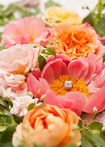
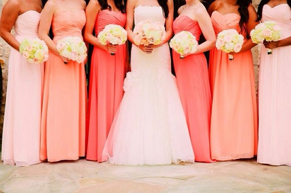
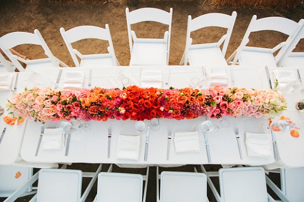
This set of subtle warm colors creates a beautiful spring wedding palette. Because they are all so similar, yet slightly different, they combine to make a warm and bright environment. Tangerine, peach and pink are great colors that contrast and blend together in harmony, making them an ideal color scheme for ombre bridesmaid dresses, gorgeous floral arrangements or stunning wedding bouquets.
Photo Credit: Style Me Pretty
Photo Credit: Ana & Ivan
Photo Credit: Grey Likes Weddings
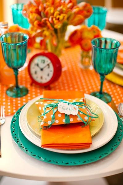
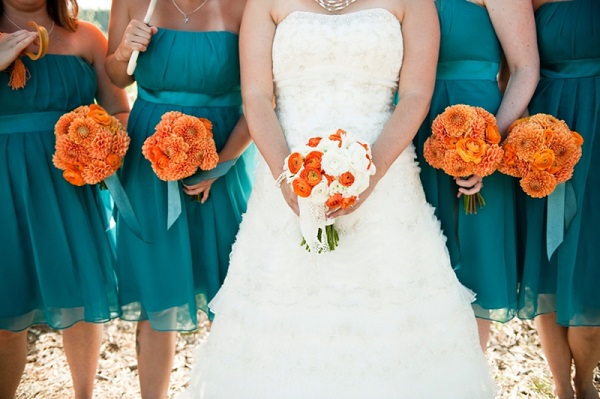
Tangerine, Teal and White
Tangerine and teal are complementary colors that work well together for spring weddings, whether it’s outdoors, at the beach or in a ballroom. These striking hues bring a bright and happy feeling into your wedding day, while white evens out and softens the overall tone. The beautiful contrast of the colors is eye-catching and makes for excellent décor, table settings and even bridesmaid dresses and bouquets.
Photo Credit: Lovely Struck
Photo Credit: Katelyn James
Photo Credit: Laurel McConnell Photography
Toasted Almond
A gorgeous neutral shade to bring balance to the springtime hues, Toasted Almond is a comforting warm beige that is organic and natural.
Perfect Palettes:
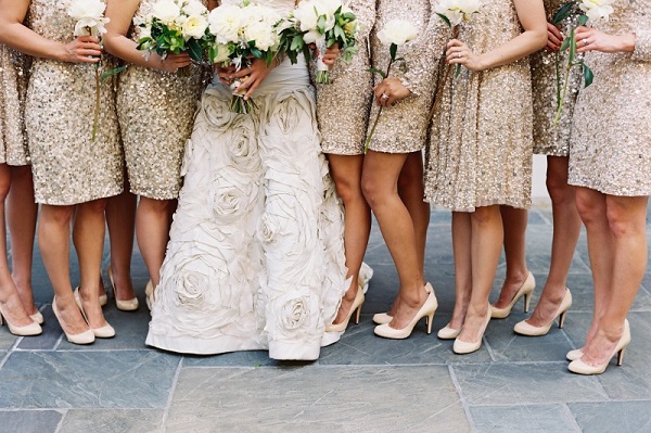
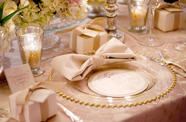
Toasted Almond, Copper and Gold
Toasted Almond is a gorgeous neutral beige color, making it the perfect base color to pair with trendy metallics, such as copper and gold. 2015 is the year that metallics and creamy ivory shades take on the classic romance theme, so what better way to include these colors in your wedding than with a Toasted Almond, copper and gold palette? These colors flatter everyone and look great as bridesmaid dresses, table settings, stationary and so much more.
Photo Credit: Tec Petaja
Photo Credit: Designs by Renee
Photo Credit: Simply Bloom Photography
Toasted Almond, Baby Blue and Sage Green
Toasted Almond blends beautifully with soft, cool shades such as baby blue and sage green. Succulents and natural décor, centerpieces and table settings all look great in this color scheme, and your groomsmen will look dapper in beige suits and pastel ties.
Photo Credit: Wed Society
Photo Credit: Elegant Wedding Invites
Photo Credit: Pinterest
This spring, there’s plenty of pastel and neutral shades creating stunning wedding color schemes. Splashes of bright colors, such as turquoise, coral and metallics, add a brilliant touch to your dream wedding. Whether you choose to tie the knot in a gorgeous indoor celebration or a rustic outdoor soiree, these color combinations are must-tries this season.

